|
The Connector is a behavior object available in the behavior canvas.
|
|
|
The properties displayed in the Main section of the Connector Properties panel are dependent upon the type of command the connector is exiting. If the connector is exiting a non-branch command or a Simple Branch command, then the only configurable properties are the Caption, Line style and Caption Box Width. If the connector is exiting a Multiple Branch command, then additional properties will be available for configuration.
|
 Exiting any object other that a Multiple Branch Command
|
|
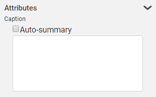
The attribute section is where you can set a caption to be shown on the connector.
|
|
|
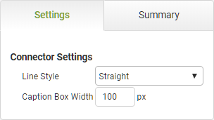
The settings section allows you to define line style and the size of the box displaying the caption.
|
Attributes
|
Object
|
Details
|
Caption
|
Enter the the text that will be shown on the connector object in the behaviors canvas.
|
Settings
|
Line Style
|
Specify the style of the line. The default setting is Straight. Choose Curved if you want to use a curved line to avoid other objects on the .
|
Caption Box Width
|
Specify the width of the box displaying the caption.
|
|
 Exiting a Multiple Branch Command
|
|
The attribute section is where you can set a caption to be shown on the connector.
|
|
|
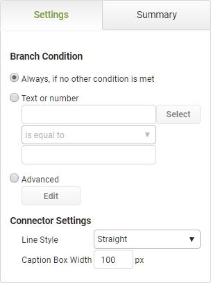
The settings section allows you to define the condition on the branch, the line style and the caption box width.
|
Attributes
|
Object
|
Details
|
Auto-summary
|
This option is selected by default, the system will automatically generate a summary that is show in the lower half of the object based on selections made.
Un-check this box if you want to add your own text instead.
|
Branch Condition
|
Always, if No Other Condition is Met
|
Select this radio button to ensure the selected join line behavior always executes at app run-time.
|
Simple
|
Select this radio button to set a simple condition based on an app field that must be satisfied for the behavior to continue to the next branch.
|
|
|
Click Select to choose the app field or object for the condition. Once a selection has been made, the value will be shown in the read-only text box to the left of the Select button.
|
|
|
Select the operation from the drop-down list that will run against the field. Options include:
ois equal to ois not equal to ois less than ois greater than ois less than or equal ois greater than or equal ois empty ois not empty ois checked ois not checked |
|
|
Enter the alphanumeric value you want to compare against.

|
If the selected operation is 'is checked' or 'is not checked', this field will be disabled.
|
|
Advanced
|
Select this radio button to compose your own conditional formula that must be satisfied for the path to continue.
Click the Edit button to open the Formula and Conditions Editor.
|
Settings
|
Line Style
|
Specify the style of the line. The default setting is Straight. Choose Curved if you want to use a curved line to avoid other objects on the .
|
Caption Box Width
|
Specify the width of the box displaying the caption.
|
|
To return to the Connector object details CLICK HERE.
Return to: Behavior Commands


 Exiting any object other that a Multiple Branch Command
 Exiting a Multiple Branch Command


