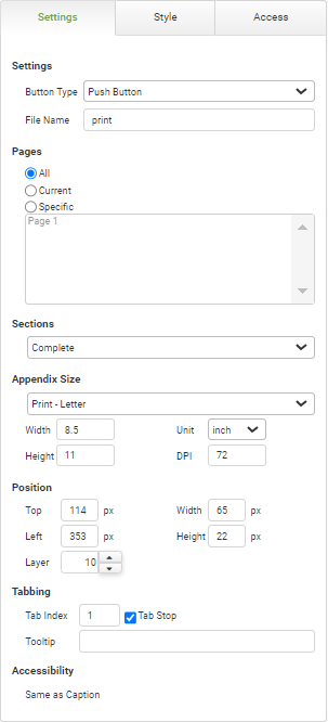
Page Button Settings
|
Object
|
Details
|
Additional Information
|
Button Type
|
Use this to control the appearance of the button. Button types include:
oPush Button oRectangular Mouse Over Button oRounded Mouse Over Button
|
|
File Name
|
Enter the name of the PDF file generated by the Print Button.
|
|
Pages
|
All
|
Selection of this radio button means that all app pages, including the appendix, will be printed.
|
|
Current
|
Selection of this radio button means that only the active app page will be printed.
|
|
Specific
|
Selection of this radio button means that only the pages selected in the list box below the 'Specific' radio button will be printed. One or more pages can be selected by holding the CTRL button and clicking on the pages to be included.
|
|
Sections
|
[Sections Selection]
|
Select which sections to print in addition to the pages specified in the 'Pages' section. Options include:
•Complete - Prints the app pages and, if there is an appendix needed, will print a separate page with the entire table. •App Pages Only (no helper or hidden pages) - Will not print an appendix page. •Complete But Separated - Will print app pages and appendix pages as separate PDFs. •Appendix Only - Will not print app pages. |

|
Data that is not visible on screen, normally in multi-line text input and table objects, can be presented in an appendix.
|
|
Appendix Size
|
[Appendix Size Selection]
|
Select the page size for the appendix. Options include:
•Custom •Print - Letter •Print - Legal •Print - Executive •Print - DIN A4 •Print - DIN A5 •Print - DIN B4 •Print - DIN B4 |
|
Width
|
Specify the width of the printed appendix.
|
|
Unit
|
Select inches or other dimension units to help determine the size of the printed appendix.
|
|
Height
|
Specify the height of the printed appendix.
|
|
DPI
|
Specify the resolution of the printed appendix in dots per inch.
|
|
Position
|
Top
|
Displays the object's location in from the top of the app (in pixels).
|
|
Left
|
Displays the object's location in from the left margin of the app (in pixels).
|
|
Width
|
Shows the width of the object.
|
|
Height
|
Shows the height of the object.
|
The minimum height is determined by the font size and cannot be less than 10px.
|
Layer
|
Indicates the layer number this object occupies. You can drag an object so that it fully or partially covers another object. Depending on the layer number it occupies, it may be positioned underneath another other object.
|
|
Tabbing
|
Tab Index
|
Indicates the order in the tabbing sequence that this object will be arrived at when the app user is using their Tab key to navigate through the app fields.
|
Tab Index
|
Tab Stop
|
Clear this check box to exclude the object from the tab order altogether.
|
|
Tooltip
|
Enter tooltip text to show to an app user when they hover their mouse over the object.
|
|
Accessibility
|
Same As Caption
|
App users accessing the app with the JAWS accessibility tool will be read the caption of the check box.
|
Accessibility and JAWS Compatibility
|


