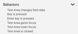
Text Area Settings
|
Object
|
Details
|
Additional Information
|
Header
|
Enter the text to be displayed in the text area column header
|
|
|
The  button, when shown, indicates that at least one alternative language has been selected. Clicking this button will open the translation panel, allowing for translations to be added or modified. For more information, see: Using Multiple Languages button, when shown, indicates that at least one alternative language has been selected. Clicking this button will open the translation panel, allowing for translations to be added or modified. For more information, see: Using Multiple Languages
|
|
Width
|
Edit the width (in pixels) of the object presented in this column.
|
|
Alignment
|
Choose the alignment of the text within the object: left, center, or right.
|
The default setting for a Text Area object is left.
|
[default text]
|
Enter a default value for the object (optional).
|
|
Max Chars
|
Enter the maximum number of characters for the text area. The object will default to a value of 400, the maximum is 99,999
|
|
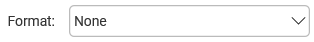
Format
|
Choose from several formatting options.
If the app user does not enter a value in the format specified, the object is displayed in red
|
If the column is mandatory they must use a correct format before submission.
If the column is not mandatory they may also clear the field before submission.
|
Autocomplete
|
|
|
Checking this box enables the autocomplete feature
|
Data in the field can be completed automatically from pre-defined lists and connections (Databases, Directory Services, REST and SOAP APIs, Google Services and text Files.)
|
|
|
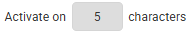
Select the minimum number of characters to activate the autocomplete function.
|
The minimum number of characters is 3.
|
|
|
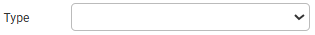
Choose the type of data-source for the autocomplete function. The options are Connection or List.
|
Further configurable fields will be displayed depending on the chosen option.
|
Autocomplete - List
|
|
|
Choose from pre-defined lists configured in the account.
See: Adding a List as an Account Resource
|
Only the caption from the list is returned.
Use the refresh button  if a new list is added and not seen in the drop-down list. if a new list is added and not seen in the drop-down list.
|
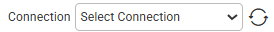
Autocomplete - Connection
|
|
|
Choose from connections configured in the account.
See: Creating Connections
|
Only connections that have at least one Select Action will be available to choose from. Use the refresh button if a new connection is added and not seen in the drop-down list.
|
|
|
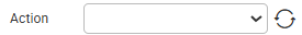
Choose from Select Actions configured in the selected connection.
See: Defining Connection Actions
|
Only Select Actions will be available to choose. Use the refresh button if a new action is added and not seen in the drop-down list.
|
|
|
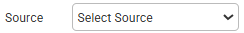
Select the source of the data from the action.
|
Action return parameters will be displayed on the Source drop-down. Only one return parameter may be chosen.
|
|
|
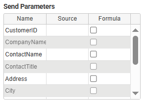
The send parameters will be displayed in a table and can be configured like in a standard connection; they can have values from a field or a formula.
|
|
Mandatory
|
Mandatory Answer
|
Select the Mandatory Answer check box to make the contents of the object required in order to submit the app instance.
You may enter a custom message in the text input below the check box. This message will be displayed if some part of the object has not been completed prior to app submission.
Click the ellipses button to display the Edit Mandatory dialog. Use this matrix to make the object mandatory based on conditions of roles and stages.
|
Marking as Mandatory
Checking for Mandatory Fields
|


