|
The Table Time Input is an app layout object found in the Table.
|
 Attributes
|
The Attributes section includes the object name.
|
Name
|
Enter a name for the column.
|
|
|
We strongly recommend that each column is given a suitable and unique name. The object name will, very likely, be referred to when adding behavior.
|
|
 Behaviors
|
|
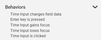
The Behavior section lists possible events on the object that can prompt a behavior to run.
|
Time Input changes field data
|
This event occurs when an app user enters data into the time input object and the object is exited.
|
Enter key is pressed
|
This event occurs when the user's cursor, or focus, is in the time input object and the enter key is pressed.
|
Time Input gains focus
|
This event occurs when the time input object becomes the active field.
|
Time Input loses focus
|
This event occurs when the time input object is exited.
|
|
This event is different than time input changes field data in that the event is triggered even when no data has been entered or modified.
|
|
Time Input is clicked
|
This event occurs when an app user clicks on the date input object.
|
|
This event is different than time input Gains Focus in that the app user must mouse-click on the object in order for the event to occur and any linked behavior commands to run. Tabbing into the object will not trigger this event.
|
|
|
 Settings
|
The settings section includes the option to set the column header and width, pre-select the date and mandatory answers.
|
Time Input Settings
|
Object
|
Details
|
Additional Information
|
Header
|
Enter the text to be displayed in the time input column header
|
|
Width
|
Edit the width (in pixels) of the object presented in this column.
|

|
The date will be presented as hh-mm with or without seconds and with or without AM/PM, and will, therefore, only take up a certain width regardless of how wide you make the column.
|
|
Date
|
Empty
|
Select this radio button to provide the app user with an empty time input object.
|
|
Now
|
Select this radio button to show the current time as the default value of the time input object.
|
|
Specific
|
Select this radio button and enter (or select from the time selector) a specific time as the default value of the time input object.
|
|
24 Hour Clock
|
Select this check box to show time in a 24-hr format (International).
|
|
Show Seconds
|
Clear this check box if you want to hide seconds from view.
|
|
Mandatory
|
Mandatory Answer
|
Select the Mandatory Answer check box to make the contents of the object required in order to submit the app instance.
You may enter a custom message in the text input below the check box. This message will be displayed if some part of the object has not been completed prior to app submission.
Click the ellipses button to display the Edit Mandatory dialog. Use this matrix to make the object mandatory based on conditions of roles and stages.
|
Marking as Mandatory
Checking for Mandatory Fields
|
|
 Style
Style
|
The Style section contains properties that control the font appearance and theme applied to the object.
|
Text
|
Object
|
Details
|
Additional Information
|
|
|
Select the font face for the text.
|
Fonts from the designers local machine will also be available provided the option to Use Custom Font has been selected in the Account Settings, however if the same font is not installed on the users machine then a standard font will be used to display the data.
|
|
|
Choose the size of the font for the text.
|
|
|
|
Enter a Hex color code or click on the color box to pick a color for the text.
|
|
|
|
Choose the style of the font for the text.
|
|
Border
|
|
|
Select the border appearance type. Choose from None or Solid.
|
|
|
|
Choose a line weight for the border (in pixels).
|
|
|
|
Enter a Hex color code or click on the color box to pick a color for the border.
|
|
|
|
Select a numeric value to represent the curvature of the object's corners. The higher the number, the more curved the the edges of the object will be.
|
|
Background
|
|
|
Enter a Hex color code or click on the color box to pick a background color for the object.
|
|
|
 Access
|
The Access section contains properties for field state management.
|
|
To return to the Table Time Input object details CLICK HERE.
Return to: App Layout Objects


