List Settings
|
Object
|
Details
|
Additional Information
|
Caption
|
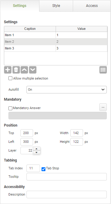
Click in the Caption column and enter the drop-down option item. Repeat in each row for all the drop-down options needed.
Each option in the drop-down list presented to the user will have a caption. The caption is the user-friendly representation of the data value equivalent for that selection.
|
|
Value
|
Enter a text or numeric value to be returned when the option is selected and submitted.
Click in the Value column and enter the data value to be associated with that drop-down option. The value can match the caption text if desired. Repeat in each row for all the drop-down options needed.
|
|

|
Click this Add Item button to add a row to the options list.
|
|

|
Click this Remove Item button to remove a row from the options list.
|
|

|
Click these Move Item Up and Move Item Down buttons to move options up and down in the options list.
|
|

|
Click the Add Predefined List button to supply a predefined list that will automatically populate the drop-down. Examples of predefined lists include States, Countries, Canadian Provinces or any list of resources that have been set up on the account.
|
Adding a List as an Account Resource
The options presented in a list object can be dynamic and based on a background look-up to another app or database. See Setting Up a Background Lookup Using a Connect Command.
|
Allow multiple selection
|
Select this check box to allow multiple selections within your list object. App users will be able to select more than one option at once by pressing CTRL + Shift and choosing the desired options from the list.
|
|
Autofill
|
The autofill feature permits compliance with WCAG 2.1
|
The default value of 'On' will allow the field to auto-populate with frequently used data recorded in the app users browser.
|
Mandatory
|
Mandatory Answer
|
Select the Mandatory Answer check box to make the contents of the object required in order to submit the app instance.
You may enter a custom message in the text input below the check box. This message will be displayed if some part of the object has not been completed prior to app submission.
Click the ellipses button to display the Edit Mandatory dialog. Use this matrix to make the object mandatory based on conditions of roles and stages.
|
Marking as Mandatory
Checking for Mandatory Fields
|
Position
|
Top
|
Displays the object's location in from the top of the app (in pixels).
|
|
Left
|
Displays the object's location in from the left margin of the app (in pixels).
|
|
Width
|
Shows the width of the object.
|
|
Height
|
Shows the height of the object.
|
The minimum height is determined by the font size and cannot be less than 10px.
|
Layer
|
Indicates the layer number this object occupies. You can drag an object so that it fully or partially covers another object. Depending on the layer number it occupies, it may be positioned underneath another other object.
|
|
Tabbing
|
Tab Index
|
Indicates the order in the tabbing sequence that this object will be arrived at when the app user is using their Tab key to navigate through the app fields.
|
Tab Index
|
Tab Stop
|
Clear this check box to exclude the object from the tab order altogether.
|
|
Tooltip
|
Enter tooltip text to show to an app user when they hover their mouse over the object.
|
|


