Numeric Input Settings
|
Object
|
Details
|
Additional Information
|
Number
|
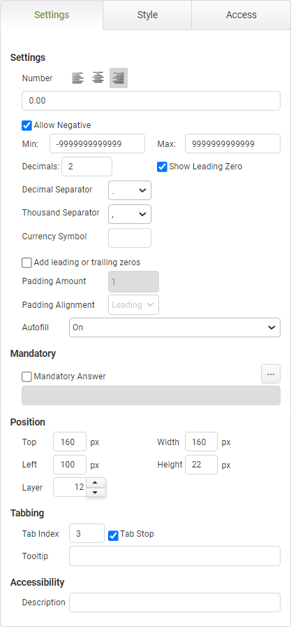
Enter a default value for the field.
|
|
Alignment
|
Choose the alignment of the text within the object: left, center, or right.
|
|
Allow Negative
|
Select this check box to allow a negative value.
|
|
If you select this check box, you will also need to specify a negative minimum value in the "Min" field below.
|
|
|
Min
|
Enter a minimum value for the object, if needed.
|
|
Max
|
Enter a maximum value for the object, if needed.
You may enter up to 12 characters. You may choose to include a decimal or not, as long as the number of characters entered does not exceed 12.
|
|
Decimals
|
Edit the default decimal places, if needed.
|
Choose from 0, 1, 2 or 3 decimal places.
|
Show Leading Zero
|
Clear this check box to hide a leading zero.
|
|
Decimal Separator
|
Edit the default character that separates decimals from whole integers.
|
|
Thousand Separator
|
Edit the default character that separates thousands in the numeric format, if needed.
|
|
Currency Symbol
|
Enter a (currency) symbol that will also be displayed in the numeric input field to the left of the numeric data.
|
|
Add leading or trailing zeros
|
Check this box to select the Padding option.
If selected, all of the other formatting options will be canceled.
|
 Best Practice: Best Practice: It is recommended to limit padding to categorical numeric data where the number does not have a mathematical value. Calculations and manipulations to padded data are not recommended since the value of a padded field will be the visible display, not the entered value. This will be particularly important when using trailing alignment.
Use Case:
Padding is great for employee identification numbers which must be a specific length. For example, if an employee number is 7 digits, the user can enter 45, and zeros will be used for the remaining five digits displaying the employee number as 0000045 if leading alignment is selected or 4500000 if trailing alignment is selected.
|
|
Padding Amount
|
Select the padding amount from the Numeric Stepper.
(Maximum possible selection is 12)
|
The value selected will be the the total number of characters including the number entered.
For example, enter 45 into a field with Padding Amount of 4 and the result shown will either be 0045 (Leading Alignment) or 4500 (Trailing Alignment)
|
Padding Alignment
|
Select Leading or Trailing
|
Specifies if the zero's added are before or after the number entered.
|
Autofill
|
The autofill feature permits compliance with WCAG 2.1
|
The default value of 'On' will allow the field to auto-populate with frequently used data recorded in the app users browser.
|
Mandatory
|
Mandatory Answer
|
Select the Mandatory Answer check box to make the contents of the object required in order to submit the app instance.
You may enter a custom message in the text input below the check box. This message will be displayed if some part of the object has not been completed prior to app submission.
Click the ellipses button to display the Edit Mandatory dialog. Use this matrix to make the object mandatory based on conditions of roles and stages.
|
Marking as Mandatory
Checking for Mandatory Fields
|
Position
|
Top
|
Displays the object's location in from the top of the app (in pixels).
|
|
Left
|
Displays the object's location in from the left margin of the app (in pixels).
|
|
Width
|
Shows the width of the object.
|
|
Height
|
Shows the height of the object.
|
The minimum height is determined by the font size and cannot be less than 10px.
|
Layer
|
Indicates the layer number this object occupies. You can drag an object so that it fully or partially covers another object. Depending on the layer number it occupies, it may be positioned underneath another other object.
|
|
Tabbing
|
Tab Index
|
Indicates the order in the tabbing sequence that this object will be arrived at when the app user is using their Tab key to navigate through the app fields.
|
Tab Index
|
Tab Stop
|
Clear this check box to exclude the object from the tab order altogether.
|
|
Tooltip
|
Enter tooltip text to show to an app user when they hover their mouse over the object.
|
|
Accessibility
|
Description
|
Enter text that will be read aloud or converted to Braille for JAWS users.
|
Accessibility and JAWS Compatibility
|


