For a complete list of table properties and their uses, see the Table reference topic.
|
To add a table: |
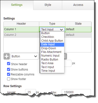
1.With an app loaded in the App Designer in Layout view, expand the Advanced Inputs section of the Toolbox. 2.Drag and drop a Table object onto the layout area. Once dropped, the table will contain two columns, both of type Text Input. 3.In the Table Properties, the Columns list shows the following information for all columns in the table. •Header - This is the name of the column. To edit this, double-click on the Header cell and you will be taken to the column's properties. •Type - This is the data type for the selected column. This type can be changed from the drop-down list that appears when the cell is selected. •State - To edit the column state, double-click on the Header cell and you will be taken to the column's properties. 4.In the Columns list, click on Type and choose the object type you want the selected column to be.  5.Choose from the following types: •Button - Show a button, which, when clicked, can run a behavior
•Check box - A regular check box
•Child app - See Linking Apps and Using Parent-Child Relationships for a full explanation. In short, it causes a new instance of a user-specified app to be displayed. PerfectApps maintains the relationship between the button and the child app so if it is clicked again, it will show that same child app instance.
•Date input - A direct date input field with a pop-up calendar
•Drop-down - A drop-down list of optional values
•File Attachment - Allows the user of the app to attach a file within a table row
•Numeric input - Numeric entry only
•Radio Button - The radio button object acts only as a visual indicator of one item selected in a table. Unlike a regular Radio Button object, no specific value can be returned from the user's selection in a Radio Button Column.
•Text Area - Multi line text input
•Text input - Text entry on a single line
•Time Input - Time input
6.To edit the column header, double-click on the column in the table. The Properties panel will show the available properties for the type of column selected. In the column properties panel, enter the column title in the Header field. 7.To add a new column to the table, return to the Table Properties panel. Select the required column type and click the Add Column button under the Columns list.
8.Return to the Table Properties panel. Select the new column type from the Type drop-down. 9.To reorder the columns, use the up and down arrows under the Columns list. 10.To make all the columns the same width, click the Fit columns evenly 11.The Rows section allows you to control the rows in the table. •Height - To change the height of the table rows, you may edit the Row Height property. Normally this should be left at its default setting. However, if you have a Text Area field, you may want to increase this value so you can see multiple lines at once. •Max - You may want to limit the number of rows of data that may be entered into the table. Update the Max field if necessary. 12.The Misc section allows you to control the following properties on the table: •Show Header - Shows a column header row •Height - The height, in pixels, of the header row •Show Buttons - Shows the row control buttons underneath the table, which allows the user to add or delete by clicking the buttons •Resizable Columns - Determines whether the app user is allowed to change the column size •Show Footer - Determines whether the table will allow the option to show a footer in selected columns (Managed in column properties) 13.Position and resize the table as with any other object. |
See also: Managing Table Properties
Return to: Working with Tables, Laying Out an App, Designing an App


