 |
For a complete list of table properties and their uses, see the Table reference topic. Table properties are separate and distinct from the properties of individual columns. See the Working with Columns topic. |
Name
Give the table a name. We recommend using a prefix or suffix of 'Tbl', 'tbl', 'Table' or similar to help you identify this in other parts of the system. For example, 'AP Table'.
Columns
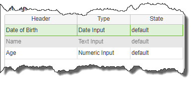
The Columns list shows all columns in the table. This list shows:
•Header - This is the name of the column. To edit this, double-click on the Header cell and you will be taken to the column's properties.
•Type - This is the data type for the selected column. This type can be changed from the drop-down list that appears when the cell is selected.
•State - To edit the column state, double-click on the Header cell and you will be taken to the column's properties.

Column Types
Choose from the following types:
•Button - Show a button, which, when clicked, can run a behavior
•Check box - A regular check box
•Child app - See Linking Apps and Using Parent-Child Relationships for a full explanation. In short, it causes a new instance of a user-specified app to be displayed. PerfectApps maintains the relationship between the button and the child app so if it is clicked again, it will show that same child app instance.
•Date input - A direct date input field with a pop-up calendar
•Drop-down - A drop-down list of optional values
•File Attachment - Allows the user of the app to attach a file within a table row
•Numeric input - Numeric entry only
•Radio Button - The radio button object acts only as a visual indicator of one item selected in a table. Unlike a regular Radio Button object, no specific value can be returned from the user's selection in a Radio Button Column.
•Text Area - Multi line text input
•Text input - Text entry on a single line
•Time Input - Time input
Rows
These properties allow you to control the following for the rows in your table:
•Height - This represents the height of a row (in pixels). Normally this should be left at its default setting. However, if you have a Text Area field, you may want to increase this value so you can see multiple lines at once.
•Max - This is the maximum number of lines of data that may be entered into the table. (Each page in a table will hold a maximum of 50 rows)
Misc
These properties allow you to control the following:
•Show header - This check box controls whether or not the column header row is hidden or shown.
•Height - This controls the height, in pixels, of the header row. Note that the text of the header must be specified in the Column properties panel, not the Table Properties. If the header text is long, increase the Height property in the Table properties and this will allow the header text to wrap.
•Show buttons - This check box controls the availability of the row control buttons under the table. When shown, the user can add or remove rows by clicking the buttons.
•Resizable columns - This check box toggles off an on the ability for the user to change the width of the columns.
•Show Footer - Determines whether the table will allow the option to show a footer in selected columns (Managed in column properties)
State
This functions in the same manner as the general field state management. For additional information on field state see the Limiting User Access to App Fields topic.
Style
This section allows you to achieve considerable control over the look and feel of the table by adjusting the style properties. This includes the ability to:
•adjust the background color for the header, rows and table itself
•set border style, size and color
•reset the theme if necessary.
See also: Working with Columns
Return to: Working with Tables, Laying Out an App, Designing an App
