|
|
The Ranking object is an app layout object found in the input .
|
 Attributes
|
|
The Attributes section includes the object name.
|
Name
|
Enter a name for the object. This is the name of the object as it will show in field chooser, the Navigation panel and other object lists.
|
|
|
We strongly recommend that each input object is given a suitable and unique name that reflects the data that will be held within it. The object name will, very likely, be referred to when adding behavior and workflow logic as well as when designing reports.
|
|
 Behaviors
|
|
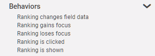
The Behavior section lists possible events on the object that can prompt a behavior to run.
|
Ranking changes field data
|
This event occurs when a choice is selected even if it's position in the ranking list is not changed.
|
Ranking gains focus
|
This event occurs when the ranking object becomes the active field.
|
Ranking loses focus
|
This event occurs when the ranking object is exited.
|
Ranking is clicked
|
This event occurs when an app user clicks on the ranking object.
|
|
This event is different than 'Ranking gains focus' in that the app user must mouse-click on the object in order for the event to occur and any linked behavior commands to run.
|
|
Ranking is shown
|
This event occurs when the ranking object is shown.
|
|
 Settings
|
|
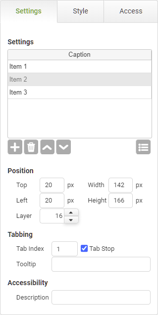
The settings section includes the ranking captions, positioning, tabbing, tool-tip and accessibility.
|
Ranking Settings
|
Object
|
Details
|
Additional Information
|
[Caption]
|
Click on a row and enter each list item to be shown in the ranking object.
|
|

|
Click this Add Item button to add a row to the ranking list.
|
|

|
Click this Remove Item button to remove a row from the ranking list.
|
|

|
Click these Move Item Up and Move Item Down buttons to move items up and down in the ranking list.
|
|

|
Click the Add Predefined List button to supply a predefined list that will automatically populate the ranking list. Examples of predefined lists include States, Countries, Canadian Provinces or any list of resources that have been set up on the account.
|
Adding a List as an Account Resource
The options presented in a ranking object can be dynamic and based on a background look-up to another app or database. See Setting Up a Background Lookup Using a Connect Command.
|
Position
|
Top
|
Displays the object's location in from the top of the app (in pixels).
|
|
Left
|
Displays the object's location in from the left margin of the app (in pixels).
|
|
Width
|
Shows the width of the object.
|
|
Height
|
Shows the height of the object.
|
The height cannot be less than 50px.
|
Layer
|
Indicates the layer number this object occupies. You can drag an object so that it fully or partially covers another object. Depending on the layer number it occupies, it may be positioned underneath another other object.
|
|
Tabbing
|
Tab Index
|
Indicates the order in the tabbing sequence that this object will be arrived at when the app user is using their Tab key to navigate through the app fields.
|
Tab Index
|
Tab Stop
|
Clear this check box to exclude the object from the tab order altogether.
|
|
Tooltip
|
Enter tooltip text to show to an app user when they hover their mouse over the object.
|
|
Accessibility
|
Description
|
Enter text that will be read aloud or converted to Braille for JAWS users.
|
Accessibility and JAWS Compatibility
|
|
 Style
Style
|
|
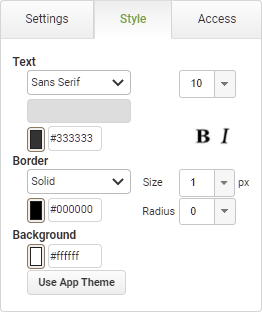
The Style section contains properties that control the font appearance and theme applied to the object.
|
Text
|
Object
|
Details
|
Additional Information
|
|
|
Select the font face for the caption text.
|
Fonts from the designers local machine will also be available provided the option to Use Custom Font has been selected in the Account Settings, however if the same font is not installed on the users machine then a standard font will be used to display the data.
|
|
|
Choose the size and style of the font for the caption text.
|
Manually enter font sizes smaller than the minimum selectable in the drop-down.
|
Color
|
Enter a Hex color code or click on the color box to pick a default color for the caption text.
|
|
|
|
Choose the style of the font for the caption text.
|
|
Border
|
|
|
Select the border appearance type. Choose from None or Solid.
|
|
|
|
Choose a line weight for the border (in pixels).
|
|
|
|
Enter a Hex color code or click on the color box to pick a color for the border.
|
|
|
|
Select a numeric value to represent the curvature of the object's corners. The higher the number, the more curved the the edges of the object will be.
|
|
Background
|
|
|
Enter a Hex color code or click on the color box to pick a background color for the object.
|
|
Use App Theme
|
|
|
Resets the appearance options to the default settings configured on the app's Theme properties.
|
Applying or Resetting a Theme
|
|
 Access
|
|
The Access section contains properties for field state management.
|
|
To return to the Ranking object details CLICK HERE.
Return to: App Layout Objects


