Text Input Settings
|
Object
|
Details
|
Additional Information
|
Max Chars
|
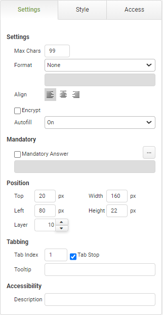
Enter the maximum number of characters for the text input. The object will default to a value of 99, the maximum is 99,999
|
|
Format
|
Choose from several formatting options including a Custom format. If you choose custom, you will be able to enter the format in the box below the drop-down.
If the app user does not enter a value in the format specified, the object is displayed in red
|
If a user enters data in an incorrect format when that format is set to Email, URL, Phone or Custom they will not be permitted to submit the app.
If the field is mandatory they must use a correct format before submission.
If the field is not mandatory they may also clear the field before submission.
See also Connect Commands to learn how an invalid format can affect data being inserted or updated into a database on submission of the app instance.
|
|
|
Choose the alignment of the text within the object: left, center, or right.
|
|
Encrypt
|
This feature is offered for an additional charge.
Click HERE to inquire.
Select this feature to encrypt the data when viewed outside of the app instance.
|
Encryption Details
|
Autofill
|
The autofill feature permits compliance with WCAG 2.1
|
The default value of 'On' will allow the field to auto-populate with frequently used data recorded in the app users browser.
|
Autocomplete
|
|
|
Checking this box enables the autocomplete feature
|
Data in the field can be completed automatically from pre-defined lists and connections (Databases, Directory Services, REST and SOAP APIs, Google Services and text Files.)
|
|
|
Select the minimum number of characters to activate the autocomplete function.
|
The minimum number of characters is 3.
|
|
|
Choose the type of data-source for the autocomplete function. The options are Connection or List.
|
Further configurable fields will be displayed depending on the chosen option.
|
Autocomplete - List
|
|
|
Choose from pre-defined lists configured in the account.
See: Adding a List as an Account Resource
|
Only the caption from the list is returned.
Use the refresh button  if a new list is added and not seen in the drop-down list. if a new list is added and not seen in the drop-down list.
|
Autocomplete - Connection
|
|
|
Choose from connections configured in the account.
See: Creating Connections
|
Only connections that have at least one Select Action will be available to choose from. Use the refresh button  if a new connection is added and not seen in the drop-down list. if a new connection is added and not seen in the drop-down list.
|
|
|
Choose from Select Actions configured in the selected connection.
See: Defining Connection Actions
|
Only Select Actions will be available to choose. Use the refresh button  if a new action is added and not seen in the drop-down list. if a new action is added and not seen in the drop-down list.
|
|
|
Select the source of the data from the action.
|
Action return parameters will be displayed on the Source drop-down. Only one return parameter may be chosen.
|
|
|
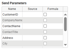
The send parameters will be displayed in a table and can be configured like in a standard connection; they can have values from a field or a formula.
|
|
Mandatory
|
Mandatory Answer
|
Select the Mandatory Answer check box to make the contents of the object required in order to submit the app instance.
You may enter a custom message in the text input below the check box. This message will be displayed if some part of the object has not been completed prior to app submission.
Click the ellipses button to display the Edit Mandatory dialog. Use this matrix to make the object mandatory based on conditions of roles and stages.
|
Marking as Mandatory
Checking for Mandatory Fields
|
Position
|
Top
|
Displays the object's location in from the top of the app (in pixels).
|
|
Left
|
Displays the object's location in from the left margin of the app (in pixels).
|
|
Width
|
Shows the width of the object.
|
|
Height
|
Shows the height of the object.
|
The minimum height is determined by the font size and cannot be less than 10px.
|
Layer
|
Indicates the layer number this object occupies. You can drag an object so that it fully or partially covers another object. Depending on the layer number it occupies, it may be positioned underneath another other object.
|
|
Tabbing
|
Tab Index
|
Indicates the order in the tabbing sequence that this object will be arrived at when the app user is using their Tab key to navigate through the app fields.
|
Tab Index
|
Tab Stop
|
Clear this check box to exclude the object from the tab order altogether.
|
|
Tooltip
|
Enter tooltip text to show to an app user when they hover their mouse over the object.
|
|
Accessibility
|
Description
|
Enter text that will be read aloud or converted to Braille for JAWS users.
|
Accessibility and JAWS Compatibility
|


 if a new list is added and not seen in the drop-down list.


