Data List Settings
|
Object
|
Details
|
Additional Information
|
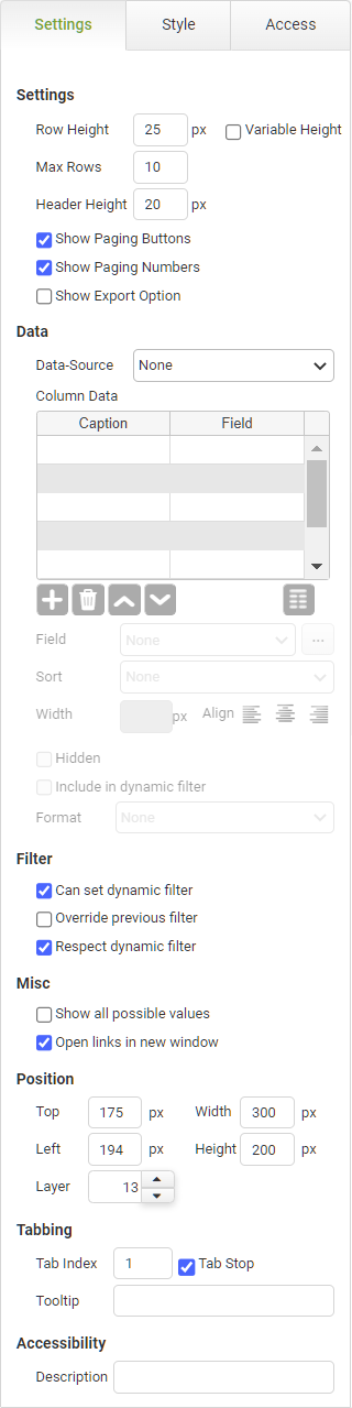
Row Height
|
Specifies the minimum row height.
|
|
Variable Height
|
Check this box to allow rows to automatically size to the maximum height required to display all data in the row.
|
|
Max Rows
|
Specifies the maximum number of rows that should be fetched from the server for this display page. You can then click the buttons beneath the list to page up or down.
|
|
|
The reason for specifying the number of rows is that you may have a very large number of records to report on. Bearing in mind that PerfectApps is a Web application, fetching them all at once across what might be a slow connection could pose performance problems. It would also waste server resources. Data is fetched one page at a time, and the Max Rows value determines how many app Instances are fetched per page.
|
|
Header Height
|
Specifies the text height in the data list header.
|
|
Show Paging Buttons
|
Uncheck the box only if you don't want to allow users to page through the list's contents.
|
|
Show Paging Numbers
|
Uncheck the box only if you don't want to display the page number of the page currently being viewed or the number of pages available.
|
|
Show Export Option
|
If you check this, an export icon will show at the bottom of the list or grid. When report users click the export button, they can specify the format of the exported data.
|
|
Data Source
|
Data Source
|
All reporting objects must point to a data source. If you have only defined one, then this will be automatically selected.
|
|
|
Although you can have multiple data sources in a report, each reporting object can only point to a single data source.
|
|
Column Data Fields
|
Caption
|
The label that is displayed in the column header.
|
|
Field
|
Displays the field that is reported. Select the appropriate row in the Column Data table and then select the required Field from the Field drop-down under the table.
Use the ellipses  to use the Formula editor to specify data based on more than one field in the app. to use the Formula editor to specify data based on more than one field in the app.
|
Using the Formula and Condition Editor
|
Add Column
|
Click the Add Column button to add a new column to the Data List.
|
|
Delete Column

|
Click the Remove Column button to remove a column from the Data List
|
|
Move up or down
|
Click the Move Column Up and Move Column Down buttons to reorder the Data List columns by moving them up and down in the list.
|
|
Fit Columns Evenly

|
Click the Fit Columns Evenly button to automatically make the widths of the columns the same.
|
|
Field
|
Click the drop-down to select the field from the data source to report on.
|
|
|
Only fields selected in the data source will be available to report on.
|
|
Sort
|
Click here if you want to sort the list using this column.
Choose from None, Ascending, Descending, or you can delegate your sort to another column in the Data Grid.
|
Delegating Sort Order for Data Lists and Data Grids
|
Width
|
Use this to specify the column width in pixels.
|
|
|
If the sum of the width of all columns is less than the width of the Data List, then the rightmost column will be expanded to take up the extra width.
If the sum of the width of all columns is greater than the width of the Data List then a scroll bar will be displayed.
|
|
Align
|
Select the alignment of the data in the column.
|
|
Hidden
|
Check this box to hide the column from view.
|
|
Include in dynamic filter
|
Check this box to include data in this column in a dynamic filter.
|
|
|
Ensure that the Can Set Dynamic Filter is also selected.
|
|
Format
|
Optionally format the field in the report.
|
|
Filter
|
Can set dynamic filter
|
This means that a selection within the object causes the filter event to be broadcast to other objects within the report that have the Respect Dynamic Filter set.
|
|
|
Multiple dynamic filters are applied with the AND or the OR operator, depending on the selection made in the data source.
|
|
Respect dynamic filter
|
Causes the object to listen to any drill-down filter triggered by the user clicking a report object with the Can Set Dynamic Filter option selected. If you do not want the object to filter its data when the drill-down occurs, then turn off this property.
|
|
Override previous filter
|
By default, each object that you click on for a drill-down filter remains in effect when subsequent objects are selected. In other words, the drill-downs you select are cumulative. However, you may want a drill-down selection to clear all other existing drill-down filters before performing its own drill-down. In this case, you would check the Override Previous box.
|
|
Misc
|
Show all possible values
|
If this is checked, then it will include values where there is a result of 0. If left unchecked then 0 value results will be omitted from the chart.
|
|
Open links in new window
|
Uncheck this default option to open the linked instance in the existing browser tab. Otherwise, the default action will be to open linked items in a new browser tab.
|
Creating a Reporting Portal
|
Accessibility
|
Description
|
Enter text that will be read aloud or converted to Braille for JAWS users.
|
Accessibility and JAWS Compatibility
|
Position
|
Top
|
Displays the object's location from the top of the app (in pixels).
|
|
Left
|
Displays the object's location from the left margin of the app (in pixels).
|
|
Width
|
Shows the object width.
|
The width cannot be less than 280px.
|
Height
|
Shows the object height.
|
The height cannot be less than 150px.
|
Layer
|
Indicates the layer number this object occupies. You can drag an object so that it fully or partially covers another object. Depending on the layer number it occupies, it may be positioned underneath another object.
|
A layer is also known as a z-index. Higher z-indexes or layers sit in front of lower ones.
|


